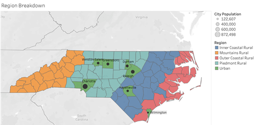
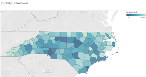
From the scenic Appalachian Mountains and beaches of the Outer Banks, to the military bases and massive hog farms down East, to geographically dispersed agricultural small holdings, to a hub of technological innovation and medicine in the Research Triangle and the banking and commercial center of Charlotte, North Carolina is a fascinatingly diverse state. Our research team conducted a deep exploration of the home mortgage market in the buildup to the 2008 financial crisis throughout the state, capturing its geographic, cultural, ethnic, and economic diversity. As shown in Figure 1, we divided North Carolina into its four main cultural and geographic regions at a county level and explored various research questions across these groupings. In addition to a strong socioeconomic and cultural divide among the state’s different regions, there is also a notable divergence between urban and rural life. To capture these differences, we isolated the state’s top urban counties (defined as having less than 20% of the county’s population residing in rural areas, leaving us with nine urban counties that we treated separately. The breakdown of these groupings is illustrated below in addition to a broad overview of some key demographic characteristics.

The broad socioeconomic picture of these regions and urban counties suggests important trends and relationships involving home ownership and mortgage markets. The Rural Mountains and Rural Outer Coastal regions are characterized by large outliers in terms of House Price Index (HPI) and income that we believe are representative of wealthy individuals who purchase vacation homes in these areas. As shown in Figure 5, the Rural Mountains and Rural Outer Coastal regions had a higher share of non-owner-occupied mortgages, pointing toward the presence of vacation and rental properties.
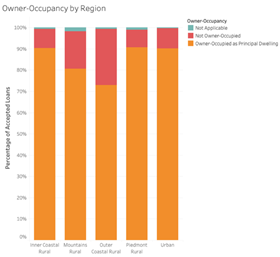
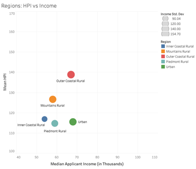
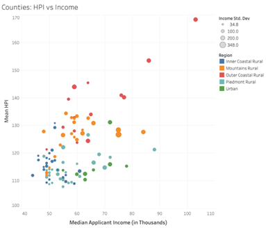
Figure 8 shows the relationship between Mean HPI (from Federal Reserve datasets) and Median Income (derived from HMDA application data) between 2000 and 2010 in the different regions, allowing us to loosely observe cost of living. As we can see in Figure 6, the Outer Coastal and Mountain regions exhibit high average costs of living, but when we look at the county-level data in the next graph, we can observe the impact of wealthy outlier counties in these regions. Furthermore, in Figure 7, the standard deviation in income for each county is reflected by the size of the dot, allowing us to observe the wide distribution of income in many outlier counties where we believe the presence of wealthy vacation homeowners has a large impact on the housing market.
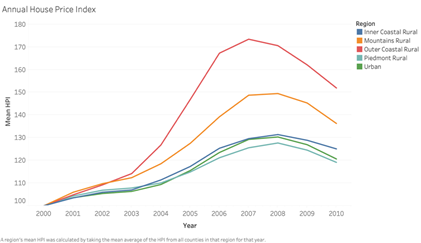
The housing markets in the Outer Coastal and Mountain regions also experienced a more dramatic peak and subsequent downfall during the 2008 crisis. This trend is observed in Figure 8, which shows mean HPI in these regions from 2000 to 2010. The Outer Coastal region’s housing market experienced its peak in 2007, whereas the other regions peak a year later. While having monthly, as opposed to annual data, would allow for far more definitive observations, it is possible that a decrease in demand for expensive beachfront property in the Outer Coastal region served as a precursor to the housing market crash. It is also possible that the crash simply hit the Outer Costal region’s housing market in 2008 harder relative to other regions, dragging down the 2008 average and showing its market peaking in 2007.
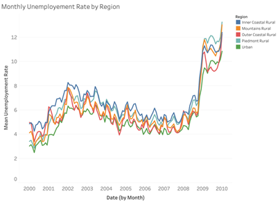
We also analyzed unemployment data from the Federal Reserve’s county-level datasets, which are conveniently available on a monthly basis. In terms of macro trends, all four regions were hit very hard in the later months of 2008, as the financial crisis wreaked havoc on the global economy. However, one interesting trend that helps differentiate the economies of these very different geographic and cultural regions is the intensity of seasonal fluctuations in unemployment. As can be seen in the temporal graph on Figure 9, the Mountain and Outer Coastal regions experience more dramatic seasonal fluctuations in unemployment as their economies rely heavily on tourism, in addition to fishing on the coast, which are both highly seasonal.
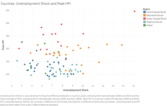
In the absence of delinquency rate data at a county level, Figure 10 can serve as a proxy for measuring how hard the housing market collapse hit a county. This graph compares peak HPI with the unemployment shock felt due to the 2008 financial crisis ( calculated as the difference between a county’s peak unemployment rate in the wake of the crisis and their mean unemployment rate from January 2000 to April 2008). HPI is standardized at 100 for all counties in 2000, which allows us to simply observe the peak as the peak of the bubble as opposed to calculating our own difference field. We can observe here how the more dramatic housing bubbles in the Outer Coastal and Mountain regions hit the local economies very hard and resulted in high unemployment shock.
As documented in the academic literature, borrowers being trapped and pressured into refinancing their high-interest rate mortgage was an integral cog in the predatory lending cycle. These refinancing loans frequently triggered prepayment penalties and other fees that proved lucrative for lending institutions, but reduced home equity for many borrowers, especially those whose lack of financial literacy was exploited by profit-driven lenders. The graph below highlights the rise in prominence of mortgage refinancing in the early 2000s. The stark drop from 2003-2004 can likely be attributed to the Federal Funds rate starting to rise in May of 2004. Home purchase loans also steadily increased during this period as housing prices soared and more North Carolinians purchased homes.
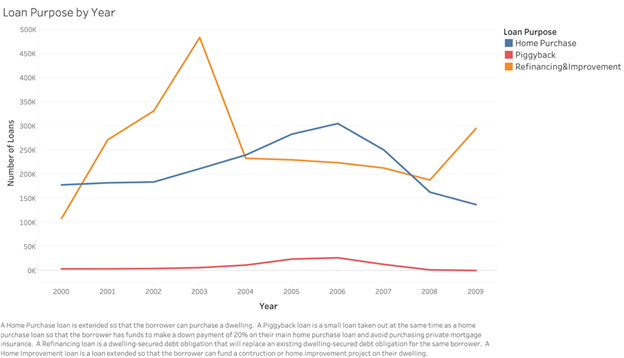
Another trend to note is the rise in popularity of piggyback loans in the mid-2000s alongside the steady increase in home purchase loans. In most cases, borrowers whose down payment makes up less than 20% of their home’s value will have to purchase private mortgage insurance (PMI). Piggyback loans are a creative tactic employed to work around this requirement, with the borrower taking out a small mortgage alongside their main mortgage to raise funds and meet the 20% down payment threshold on their main mortgage. If structured properly, the borrower can avoid paying for PMI and potentially save money. However, in the predatory lending market, where borrowers typically lack a complete understanding of the complex finances at play, piggyback loans can exacerbate costs and risks for borrowers.
Our initial plan was to simply exclude piggyback loans from our analysis of rate spreads. Research by the economists Lacour-Little, Calhoun, and Yu, however, convinced us that we needed to take account of them. Their paper finds a pattern of higher default rates for subprime borrowers who took out a piggyback loan.
Identifying piggyback loans within the HMDA dataset proved to be rather challenging as they are not marked as such. Using a described in Stanford Law’s “Opportunities and Issues in Using HMDA Data” and Charles Calhoun’s “Using 2004 HMDA Data to Analyze Piggyback Loans,” we were able to effectively flag piggyback loans within the HMDA dataset. The annual trends established by our flagging process (highlighted in the previous graph) aligned strongly with findings from the Federal Reserve.
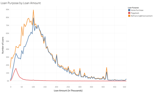
Figure 12 displays the distribution of loan purpose with respect to the loan amount from 2000 to 2010. Unsurprisingly, piggyback loans are more prevalent at smaller loan amount levels. At loan amounts under $100,000, refinancing and home improvement loans exceed home purchase loans, but the two groups are closely aligned from $115,000 onwards. This makes sense as refinancing and home improvement loans very often do not encompass the whole value of the home.
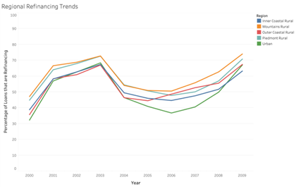
Figure 13 showcases how the peak in refinancing loans experienced around 2003 (which abate due to rising interest rates in 2004) occurred fairly consistently across all regions.
We also analyzed rate spread data to explore potential racial inequalities in the home mortgage market across North Carolina’s different regions. Instead of reporting interest rate data, HMDA requires the reporting of a rate spread if a loan’s criteria meet certain thresholds. A loan’s rate spread is the difference between its APR (Annual Percentage Rate) and a survey-based estimate of current APRs on prime mortgage loans with comparable characteristics such as loan type, maturity, and lien status. Rate spread is an incredibly useful metric for determining whether or not members of different races receive fair and equal treatment because it allows us to compare what different types of borrowers are paying for their mortgages. It does, however, come with several limitations. Rate spread reporting in the HMDA data only begins in 2004 and even then only for some loans. The following graphic (taken from the Federal Financial Institutions Examination Council) outlines the circumstances under which rate spread is not required to be reported under HMDA regulations.
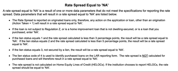
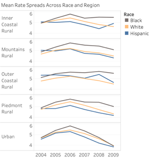
When looking at originated, first-lien loans, failure to meet the minimum rate spread threshold is one of the main reasons why a loan will not have a rate spread reported. This obviously skews the rate spread averages to be higher, but it is not hugely detrimental to our analysis, given that we are looking to identify trends in the predatory, high-priced loan market. The following graph shows average rate spreads over time, broken down by race and region, with Black borrowers clearly receiving higher average rates than their White and Hispanic counterparts. The behavior of the Hispanic segment relative to Whites yielded some interesting findings. We had been expecting to see Hispanic populations receiving higher rates than their White counterparts, but this is only consistently the case in the Outer Costal region (which has a small Hispanic population resulting in some years having small numbers of data points).
The following table demonstrates how even when controlling for risk groups, Blacks receive far higher rate spreads than Whites. In lieu of non-available credit data, we used income to loan ratio as a proxy for a loan’s riskiness. One important thing to note with this table is that it only accounts for first lien loans. We made this choice because there was a significant group of second lien loans that all fell into the high income to loan ratio group and were skewing the average for this group upward. Excluding this group makes sense as these second lien loans (which had not been marked as piggybacks as these are already excluded for all rate spread analysis) possess an inherently different element of riskiness (they should represent safer loans).
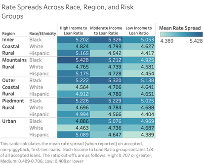
A comparison between Hispanic and White again offers intriguing evidence. When looking at “safer” loans in the high income to loan group, White borrowers receive far superior rates to their Hispanic counterparts. However, in the moderate and low ratio groups, there is a lot of flip-flopping between the two groups and they often have very comparable spreads. Interestingly, the only instance where Blacks do not receive the highest average rate spread is in the high income to loan ratio group for Urban counties. In this grouping Hispanics receive the worst rate spreads, which is especially important given that Urban counties account for a large proportion of the state’s Hispanic population. It is also interesting to note that in the high income to loan ratio groups, Hispanic spreads more closely mirror the behavior of Black spreads, while in the moderate and low ratio groups they more resemble the behavior of White spreads.
There seems to be little correlation between a loan’s “riskiness group” and the rate spread it receives across races and regions. While we might expect the high income to loan ratio group to receive the lowest spreads, as these loans should be perceived as the safest, they frequently exhibit higher average spreads than the moderate and low ratio groups.
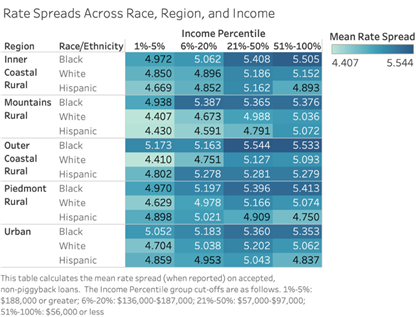
Figure 17 conducts a similar breakdown analysis, comparing borrowers across races and regions but instead controlling for income percentile. We can observe similar racial trends here, with Black borrowers paying more for their loans even when their income is comparable to their White and Hispanic counterparts. Predictably, wealthier individuals are paying less for their loans as they are more likely to be perceived as safer borrowers.
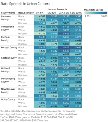
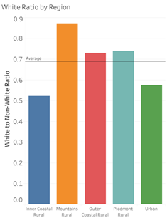
While treating the nine urban counties as a group is very useful for state-wide analysis, we also examined these urban centers separately, given their large proportion of North Carolina’s population. Figure 18 conducts a similar rate spread analysis, comparing mean rate spreads among different races in the nine urban counties, most of which are incredibly diverse demographically and home to a large proportion of North Carolina’s Black and Hispanic populations. To this point, Figure 19 compares the ratio of White to non-White inhabitants in these urban centers derived from 2010 US Census data. Even when controlling for income, Black borrowers generally tend to have mortgages with higher interest rates than their White counterparts. One thing that is important to note is that many of the Black and Hispanic groups in the top 1%-5% of the income distribution do not have many data points available. For this reason, the comparisons of rates in this income range at a county level should be taken with a grain of salt.
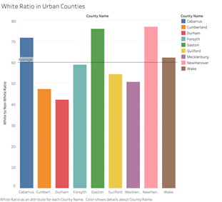
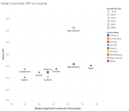
Figure 20’s plot gives further insight into the economic makeup of the urban counties, plotting mean HPI against median applicant income as we did earlier with all regions/counties. Interestingly, HPI remains fairly consistent across counties, while median applicant income varies greatly, giving us insight into the cost of living in these different urban centers.
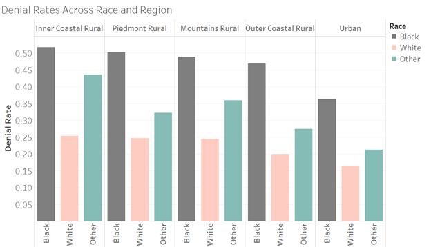
Scholars of consumer credit often use the mortgage application denial rate as a measure of credit accessibility, and the HMDA data allows a comparison of loan denial rates by race. In Figure 21, we present denial rates calculated as the total number of denied applicants divided by the total number of accepted applicants and denied applicants, excluding applications closed or withdrawn for different reasons. As the following plot shows, when broken down by regions, the Black applicants’ denial rates were the highest and the White applicants’ denial rates were the lowest across all the regions. In Inner Coastal Rural and Piedmont Rural, the Black applicants’ denial rates more than doubled those for Whites. However, since HMDA contains little information about the applicant’s creditworthiness and economic characteristics, we do not know whether creditors treated equally qualified applicants of varying backgrounds differently. Therefore, this plot does not dispositively demonstrate discrimination.
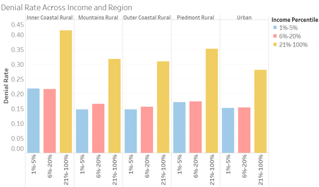
Denial rates for loans also vary according to applicants’ income levels in North Carolina. Figure 22 shows that the denial rate for low-income applicants were much higher than their high-income counterparts across all five regions. Low-income loan applicants normally had weaker-credit, resulting in a greater likelihood of rejection. There is only one region that high-income applicants did not receive the lowest denial rates, which is Inner Coastal Rural.
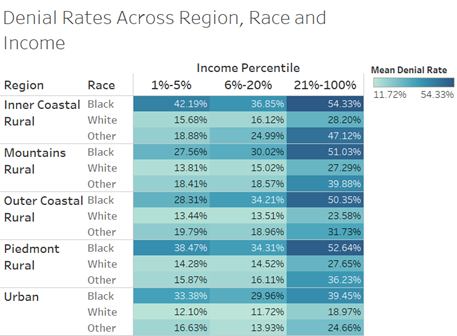
Figures 23 and 24 compare borrowers across regions and nine urban counties by race, controlling for income percentile, calculated separately for each region or county. The left table shows that the average denial rate for low-income Black applicants in Inner Coastal Rural was the highest (54.33%), followed by low-income Black applicants in Piedmont Rural (52.64%), low-income Black applicants in Mountains Rural (51.03%), low-income Black applicants in Outer Coastal Rural (50.03%), and low-income “other” applicants in Inner Coastal Rural (47.12%). Among the five regions, the minority borrowers had consistently higher denial rates than their White counterparts, and this situation was most serious in Inner Coastal Rural, with the highest proportion of Blacks in the state.
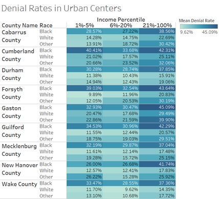
When further diving into the nine urban counties, we can observe similar findings, with Black borrowers encountering higher denial rates even when their income was comparable to their White and “other” counterparts. In Cumberland County and Forsyth County, the average denial rates for high-income Black borrowers were even higher than low-income White and “other” race in all urban counties.
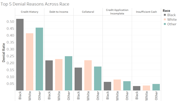
Mortgage lenders may report up to three rationales for denying a mortgage application in the HMDA database. In the North Carolina HMDA data, however, only 58.39% of entries for the denied loans included even a single reason for denial. Figure 25 shows the top five denial reasons by race. The number one reason reported by mortgage lenders for rejecting an application was credit history (42.38%), with Black applicants having the highest denial rate for this reason (51.77%). A high debt-to-income ratio was the second most frequently reported reason – responsible for more than 20.30% of denied applications. The third most frequently cited reason for denial among all applicants was related to the collateral securing the loans (20.25%), followed by lack of key information on the credit application and insufficient cash for a down payment. White applicants were more likely to be turned down due to insufficient collateral or incomplete information on the credit application than Black or “other” applicants.
